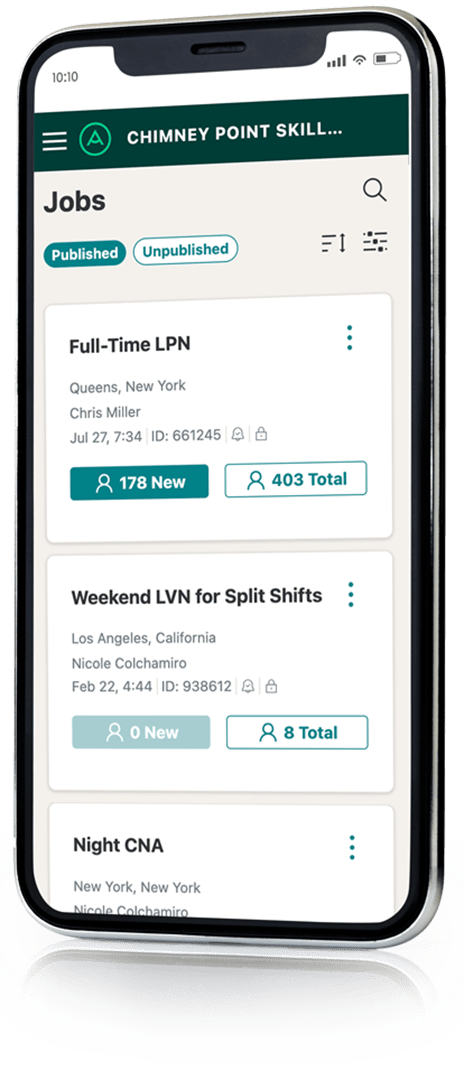
If you’ve visited the Apploi platform lately, you might’ve noticed things look a little different
Apploi’s Got a
Brand New Look

There are two changes you’ll actually notice
We won’t lie—a lot is changing under the hood. But don’t worry. Most of these changes you won’t even see.
We’re just tweaking the code to make sure we can fix bugs quickly and keep adding cool new features without too many growing pains.
The platform’s got a new look
More mobile-friendly pages!
If we’re just improving our code, you might ask, why bother changing how the platform looks?
Glad you asked.

So what’s changing?
We’ve updated the pages where you spend most of your time:
- Jobs
- Candidates
- Settings
Each of these pages will look a little sleeker now. (Stay tuned for more updated pages coming soon!) You should also find them a little bit clearer, cleaner, and easier to navigate.
Mobile Recruiting
One more piece of news. All the pages we’ve redesigned are totally mobile-friendly. That means you can review candidates right on your tablet or phone.
You’ve told us enough stories about checking Apploi on vacation that we feel pretty confident a more mobile-responsive platform will come in handy. We hope this makes it even easier to work with your teams and find great hires quickly. (Just remember to log off from time to time!)

